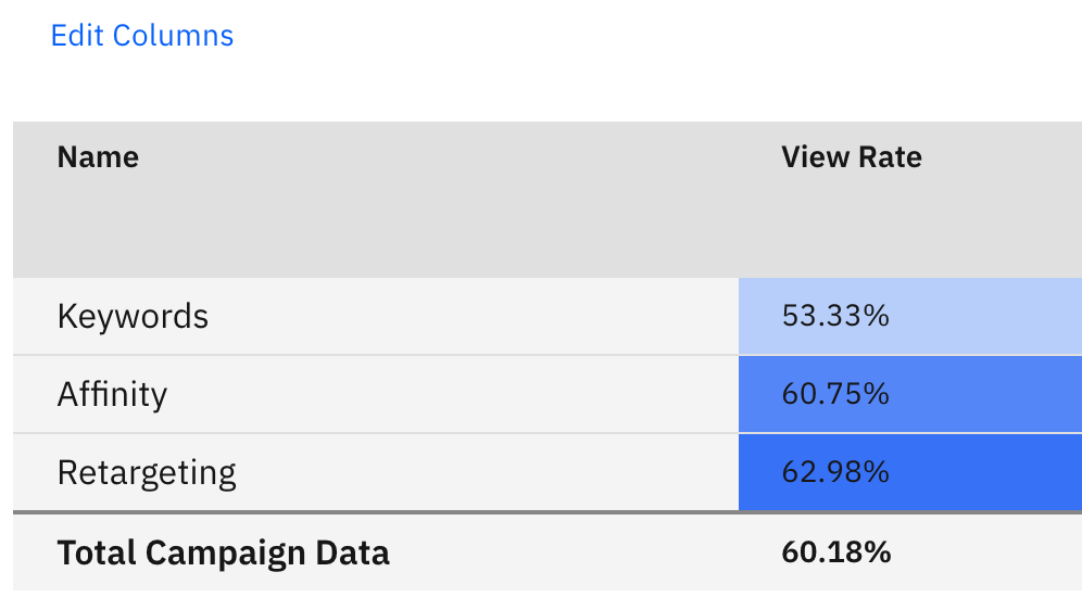
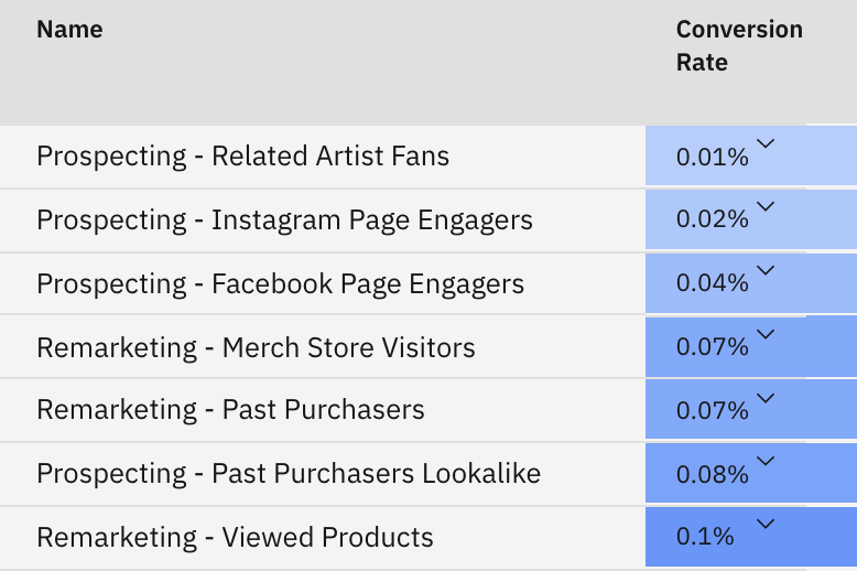
The Heatmap is a tool that highlights top-performing metrics, making favourable information easy to find and digest. They are applied to all breakdowns on the dashboard in order to allow users to clearly see their top-performing campaign segments, ad sets, and ads. The colour used in our heatmaps is blue, with lighter shades indicating lower-scale of performance and darker shades representing higher-scale. Using the example below, we can see that the highest Conversion Rate is the darkest tile, with the lower rates have lighter tiles ascending in colour to correspond with their order from high to low.
Customizing The Heatmap:
If you want to choose what exact metrics appear on your heatmap, you can do so by selecting the 'Edit Columns' button directly above the heatmap in question. This will then allow you to select or unselect your desired metrics, and once saved their performance will then be applied to the heatmap.